Building a ZX Spectrum game in Construct 3

I grew up with a ZX Spectrum +2 128k as a child, and it was amazing. At the age of 6 it was my entry into the world of computers and I was hooked. From that point in my life I knew I was going to be a software developer.
However, it's only within the last twelve months that I've made the leap from web into game development, starting with Little Martian, whose graphics are very much inspired by the games I played on the Spectrum. What I really wanted to do though, was build an actually Spectrum game. Unfortunately I don't know the Z80 assembly language required to program an actual Spectrum, nor the time to learn it – and I wanted whatever game I make to be as accessible to as many players as possible, so I started looking at whether I could recreate the same graphical limitations as the original Spectrum, in Construct 3.
Graphical limitations
The Spectrum had a very limited colour palette. There are light and dark versions of the following 8 colors: white, yellow, green, cyan, magenta, red, blue, and black, but since light black and dark black are the same, there are just 15 colours.

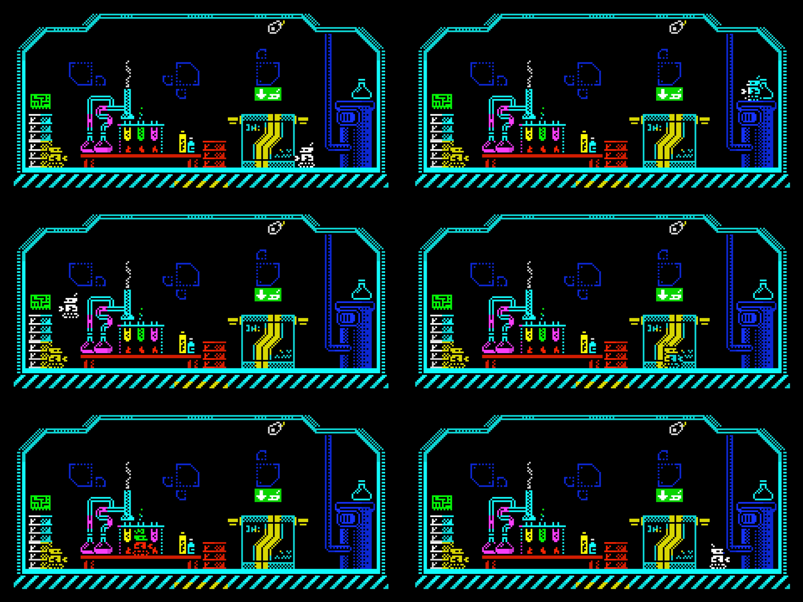
In addition to the limited color palette, there were restrictions on how the colours could be used. The viewport was divided up into 8x8 pixel 'blocks' and each block could only contain two colurs: the PAPER colour and the PEN. What's more, those two colours must both be light colours, or they must both be dark colours, they could not be mixed.
This creates a big problem when a character moves one pixel at a time, leaving them straddling two blocks. To work around this, game designers quite often took the approach of making the character take on the colours of the game's background, as can be seen in the example above. It works surprisingly well, and was used in all of the Dizzy adventure games that I played a lot.
So my challenge was to recreate these limitations in a simple and convenient way in Construct 3.
Step 1: Pen colour
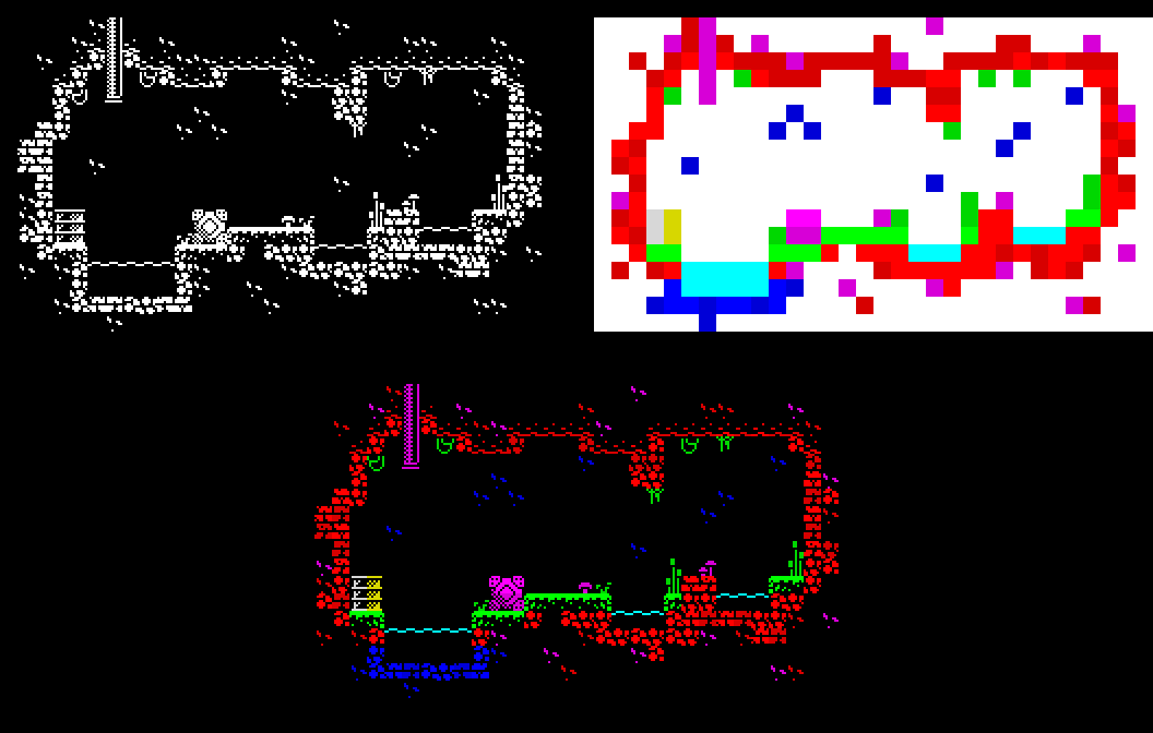
Spectrum games are essentially monochrome, with colour overlaid on top. And for the majority of games, most of the 8x8 blocks on screen used black as one of the two permitted colours. This can be very easily recreated by building the game (background, foreground objects, player, NPCs, etc) in monochrome, then applying colour via another layer that has the "multiply" blend effect:

Step 2: Paper colour
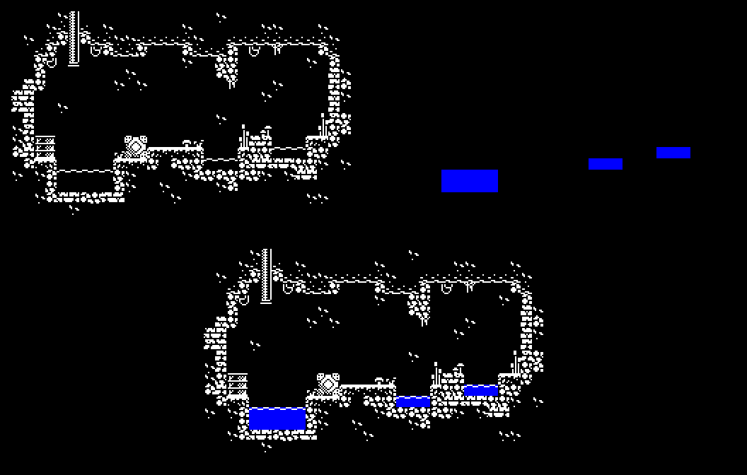
So far, this works well for setting the pen colour. But it'd be nice if those pools of water where blue with a cyan surface line, rather than just black.
We could use a very similar technique to the one we just used for setting the pen colour, using the built-in "screen" blend effect to lighten the black parts of the screen to the desired colour.

This works well, however, there's a catch: Combining the two effects – "multiply" for the pen colour and "screen" for the paper colour – results in colours that are outside of the permitted Spectrum palette.
Then I had a breakthrough: We want the pen colour to be applied only when the underlying colour is white, and we want the paper colour to be applied only when the underlying colour is black. The "multiply" and "screen" blend effects are the right choices, we just need to be selective about how we apply them.
So I started reading about fragment shaders and created a couple of simple Construct 3 addons:
Step 3: Fading in and out
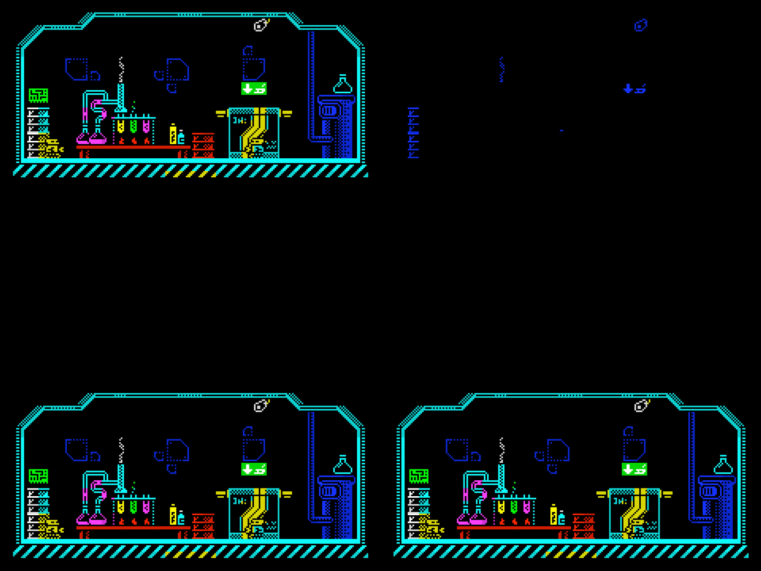
Another effect I wanted to recreate was fading in and out. With a limited palette like this we cannot simply adjust the brightness since this would result in colours outside of the palette. Instead we shift the palette (replace each colour with a different colour in the palette).
So if we shift the colours by one step we would replace white with yellow, yellow with cyan, cyan with green, etc. Then all we have to do is increase the number of steps over a period of time, from 0 to 7 at which point everything on the screen will be black. I wrote another Construct 3 plugin to handle this.
It can be applied to a layer to fade the entire layout, or to an object to fade out part of the layout and level something like the UI unaffected.
Shifting colours like this might sound strange (green to magenta to red to blue!?!), but when it happens at a reasonable speed it works surprisingly well.

In addition to the three addons, I'm also releasing a project template that shows how to use them in a really simple way:
So if you use Construct 3 and like me you're a massive Spectrum fan, please try out the project template and let me know what you think – I'd love to hear your feedback and see what you create with it. 🤖💜